Allconnex Water
A comprehensive branding programme for Allconnex Water, the specialist water and wastewater utility servicing the Gold Coast, Logan, and Redland districts. The project spanned corporate stationery, typography, uniforms, signage, publications, event collateral, and facility branding — establishing a cohesive and trusted public-sector identity.
Project name
Allconnex Water
Industry
Government
Role
Creative Direction, Brand Design
Scope
Branding
A regional utility serving three councils needed one voice, not three.
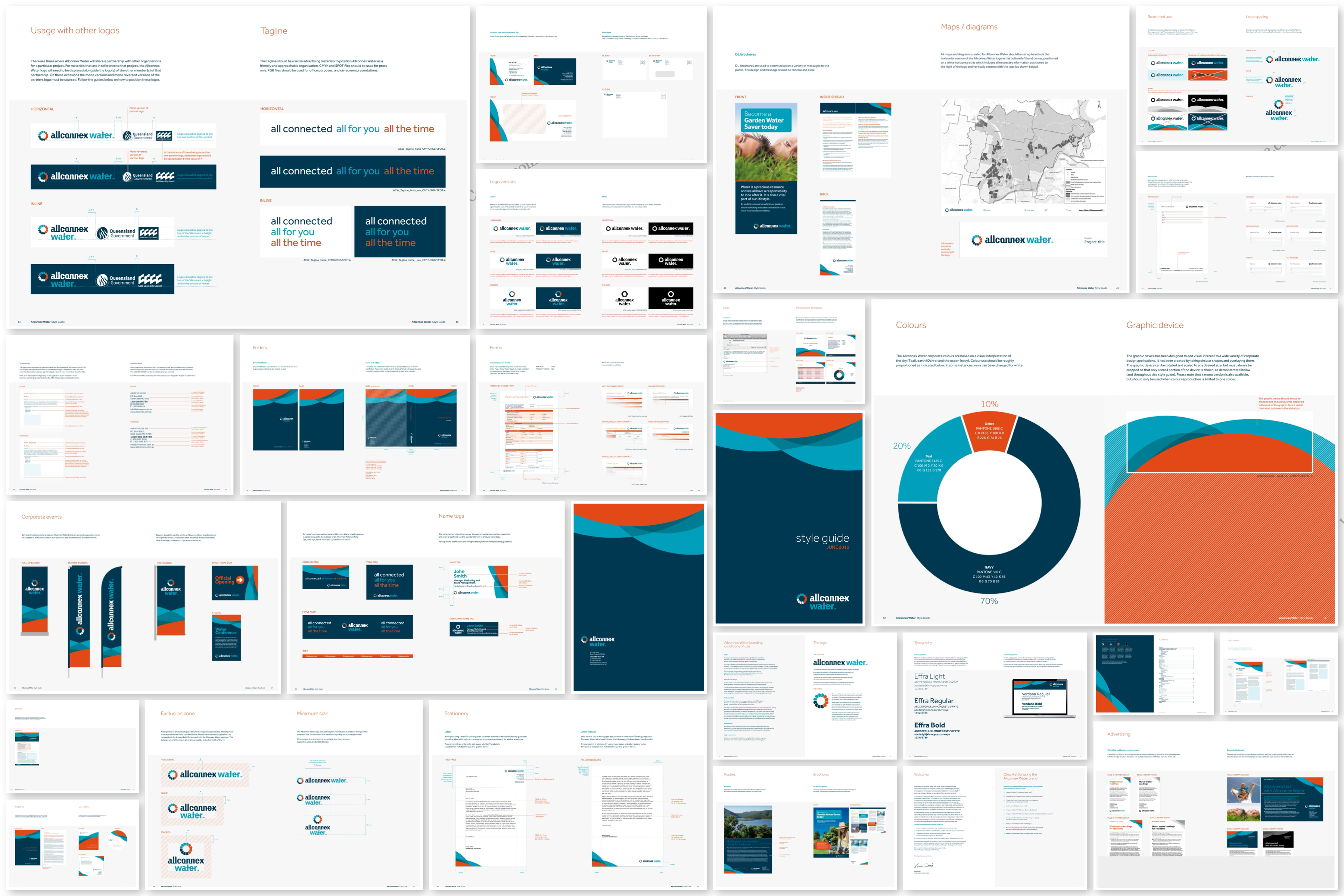
Allconnex Water required a unified visual system to represent water and wastewater services across Gold Coast, Logan, and Redland councils. The challenge was not only designing the identity, but ensuring it could be applied consistently by communications teams with varying skill levels and no prior brand management experience.
Building capability, not just assets
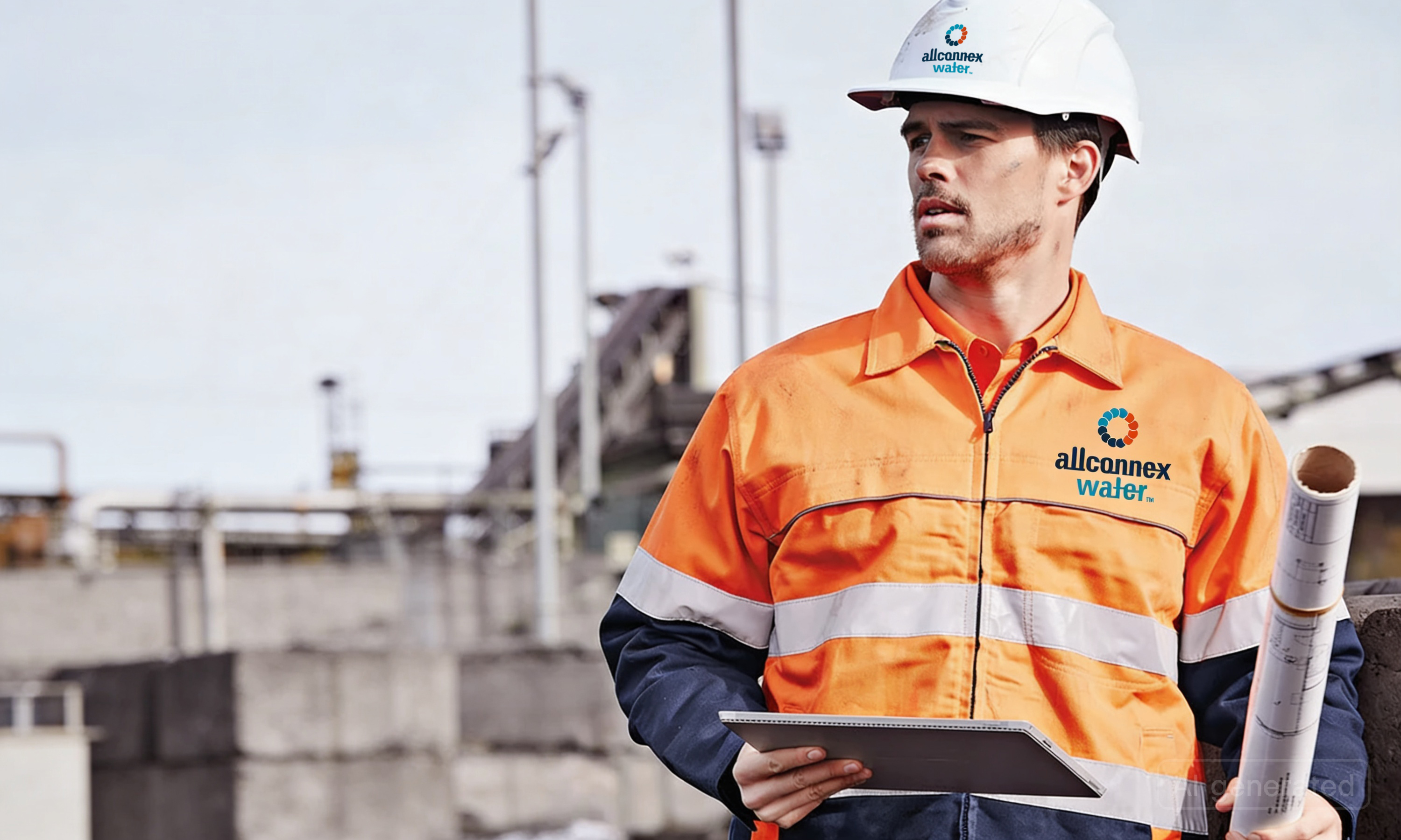
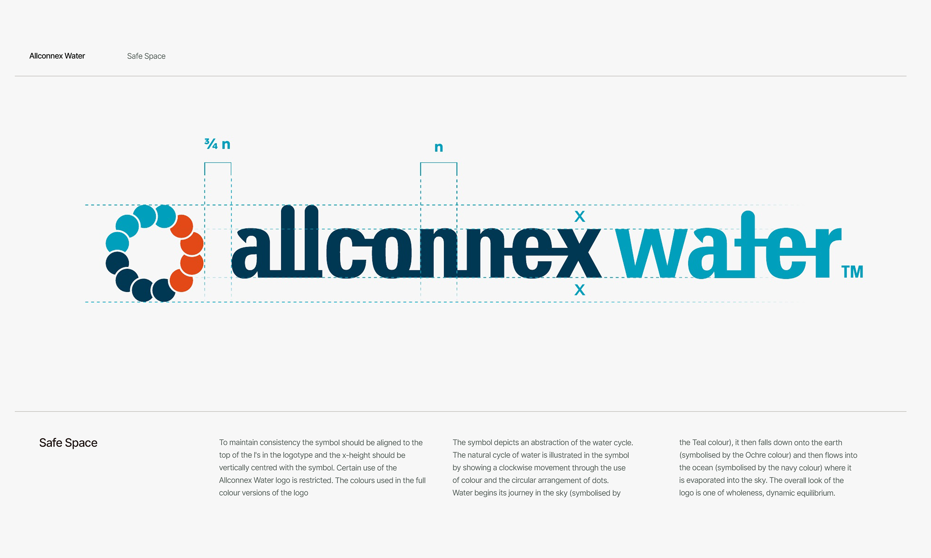
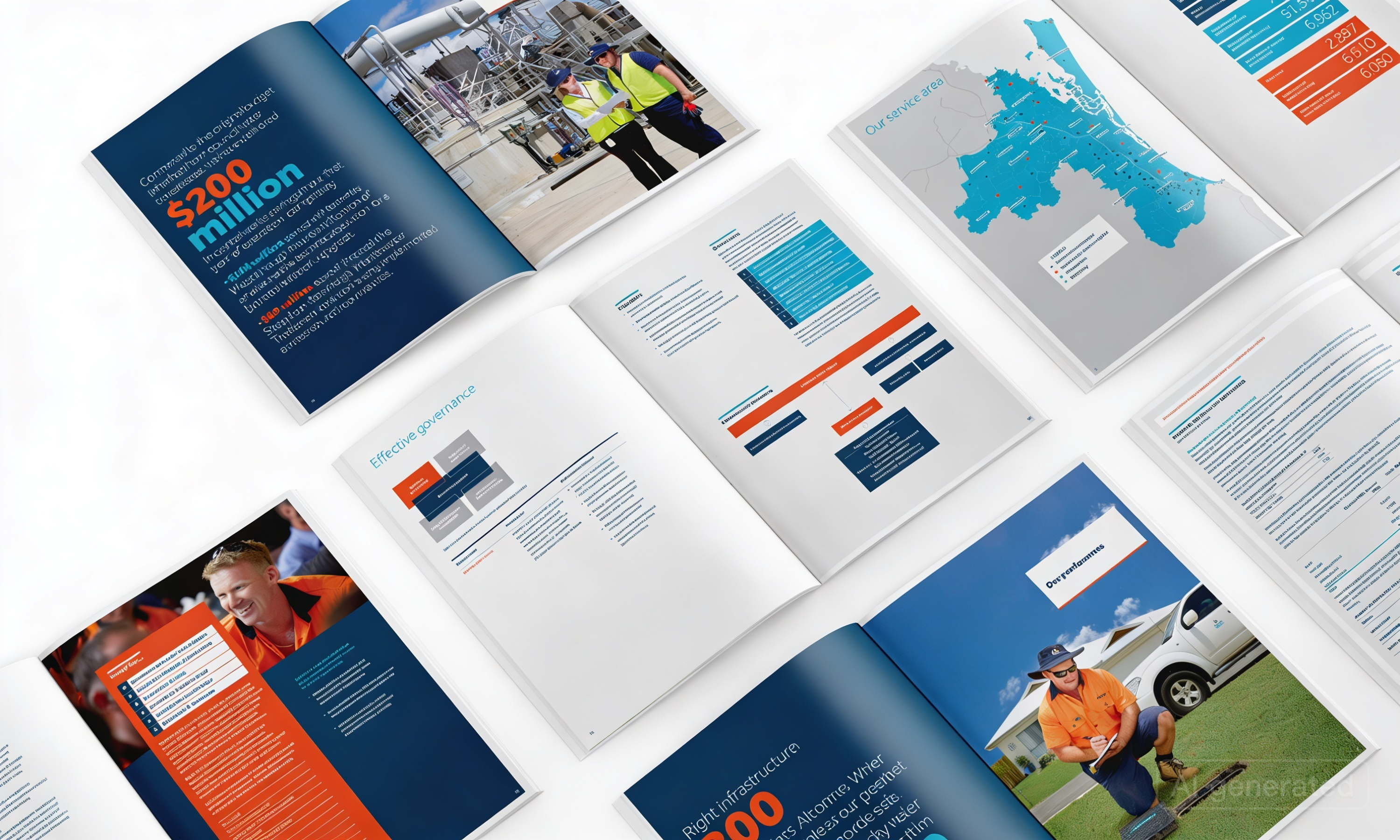
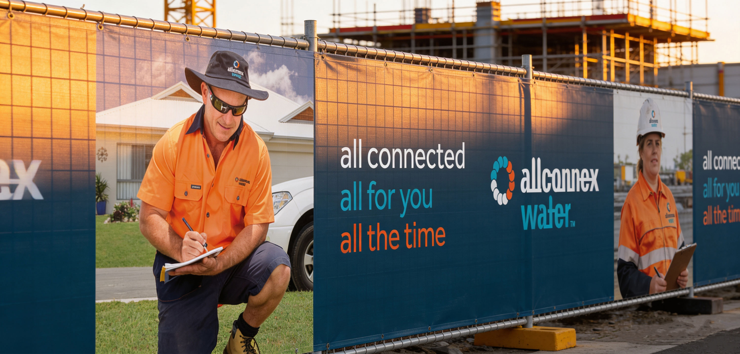
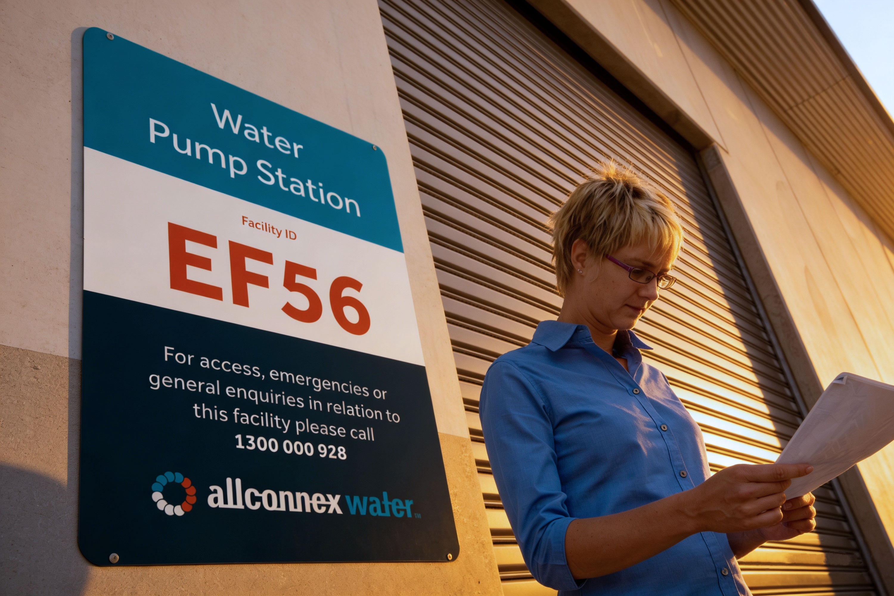
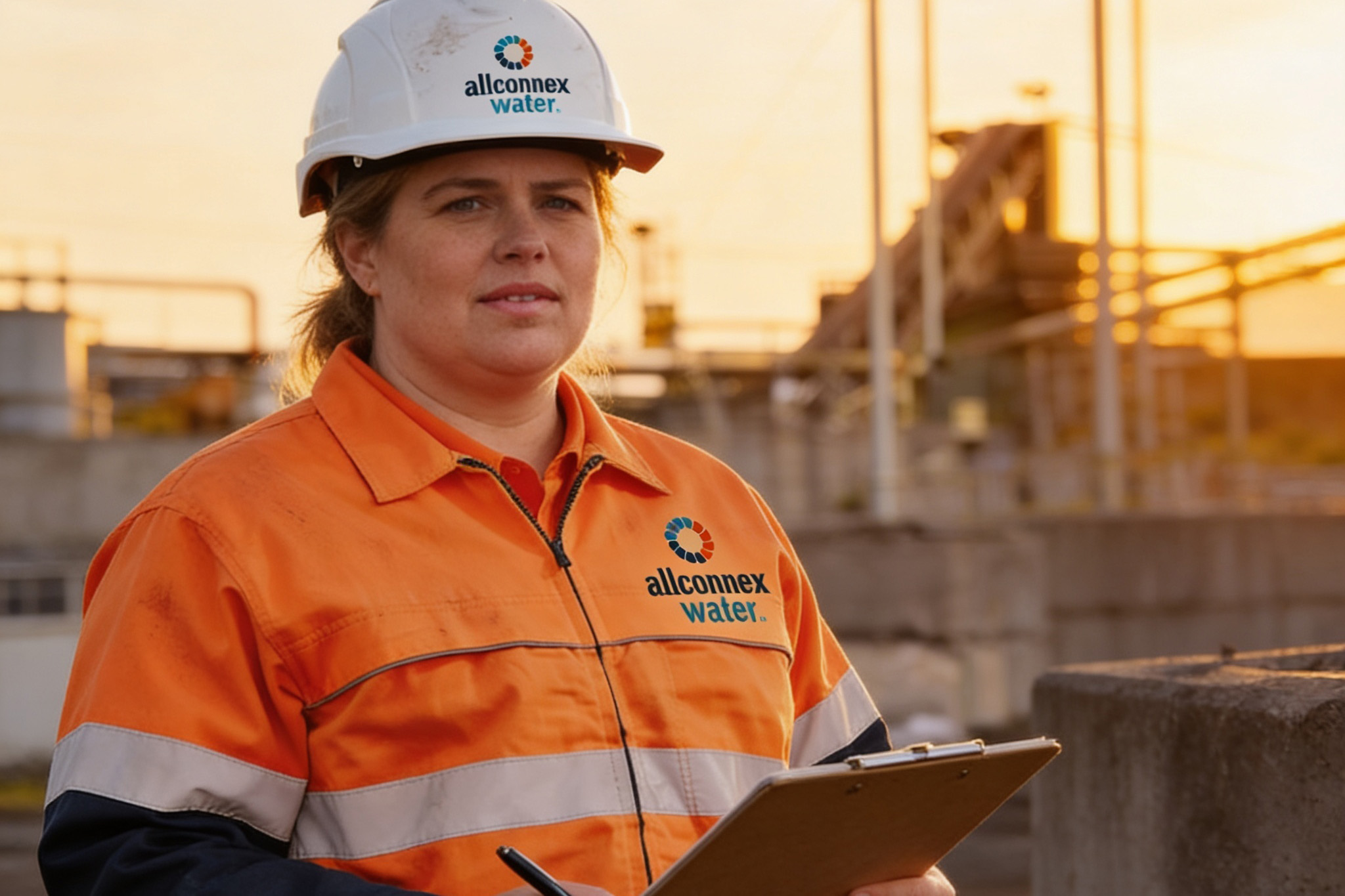
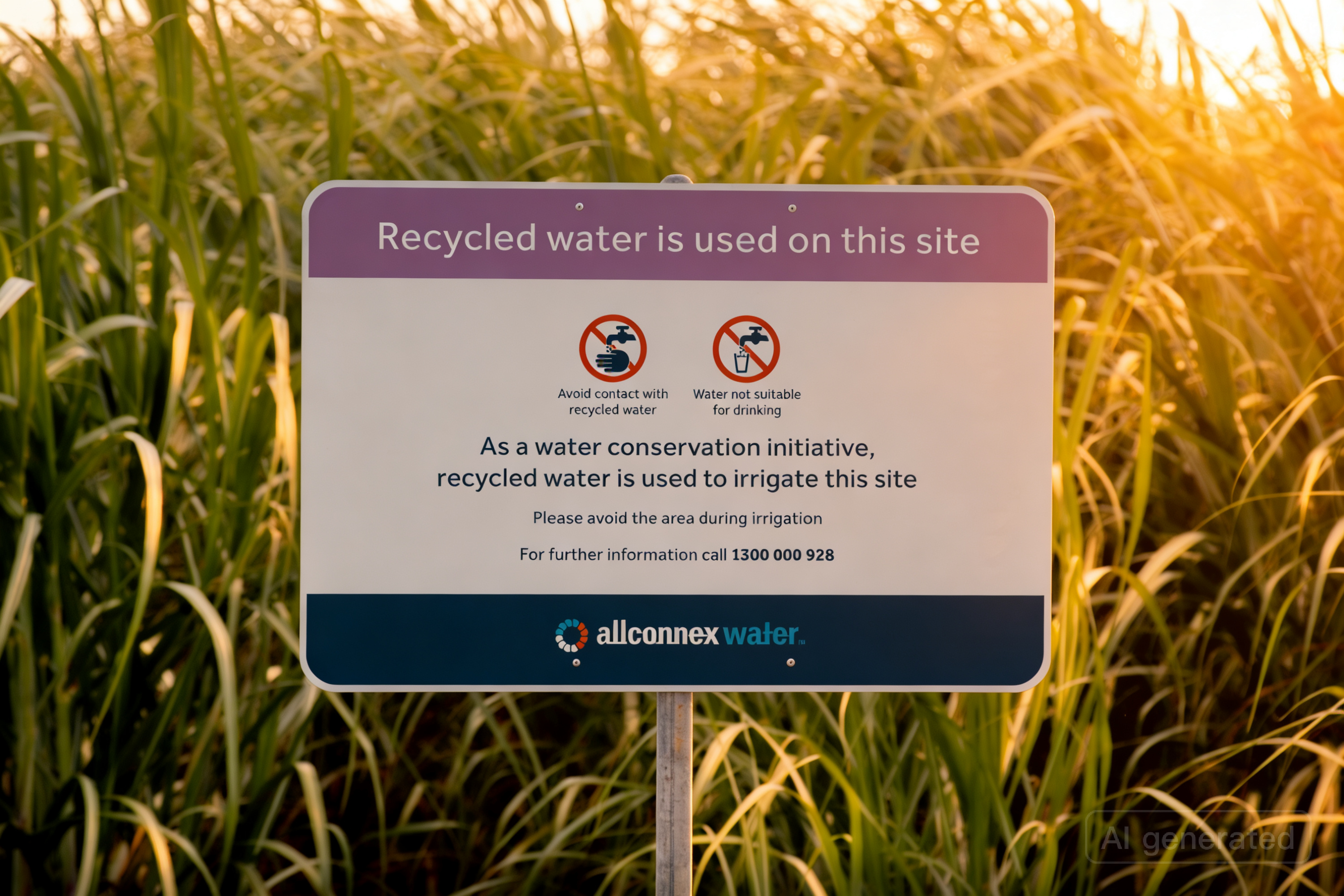
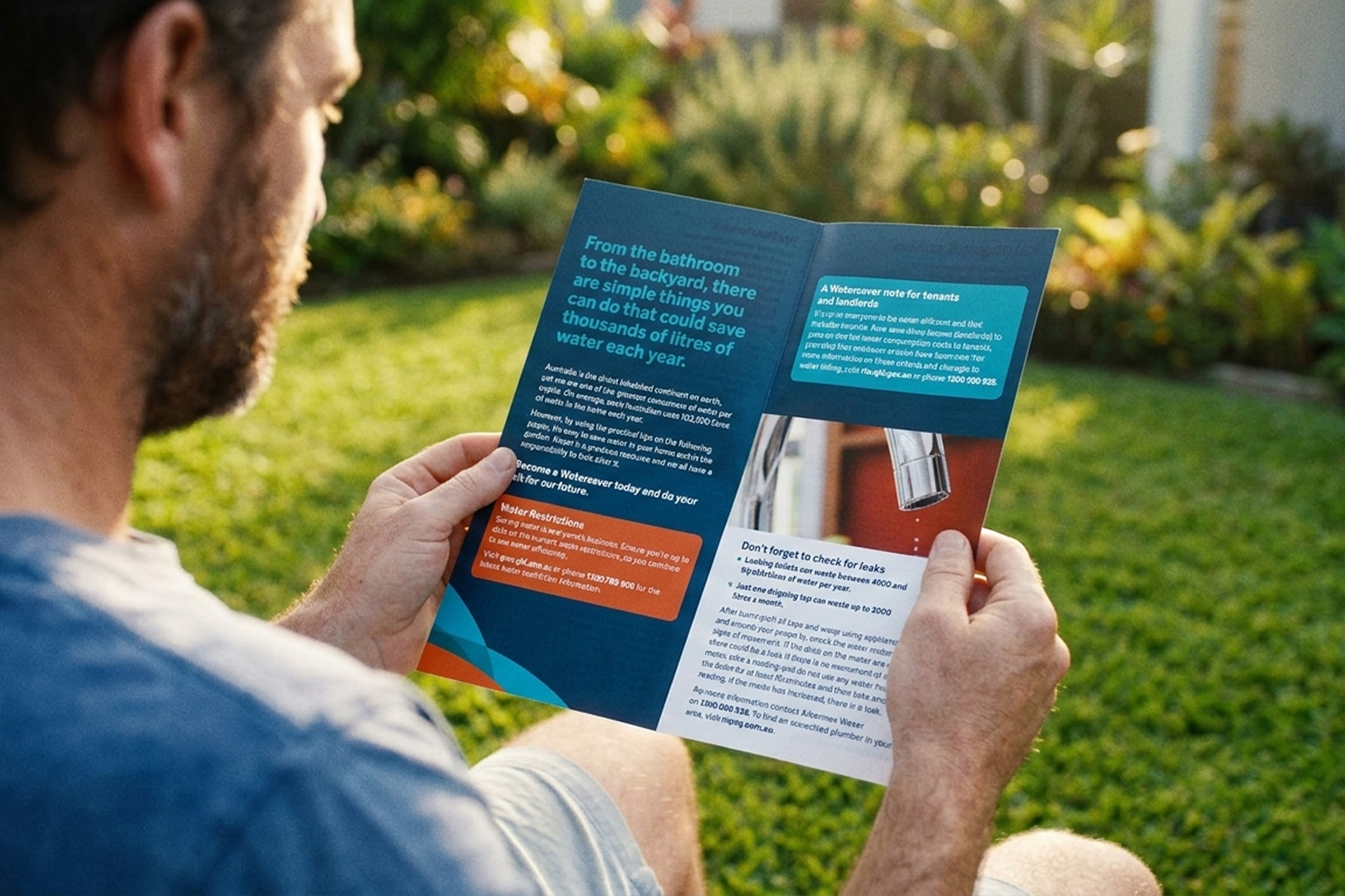
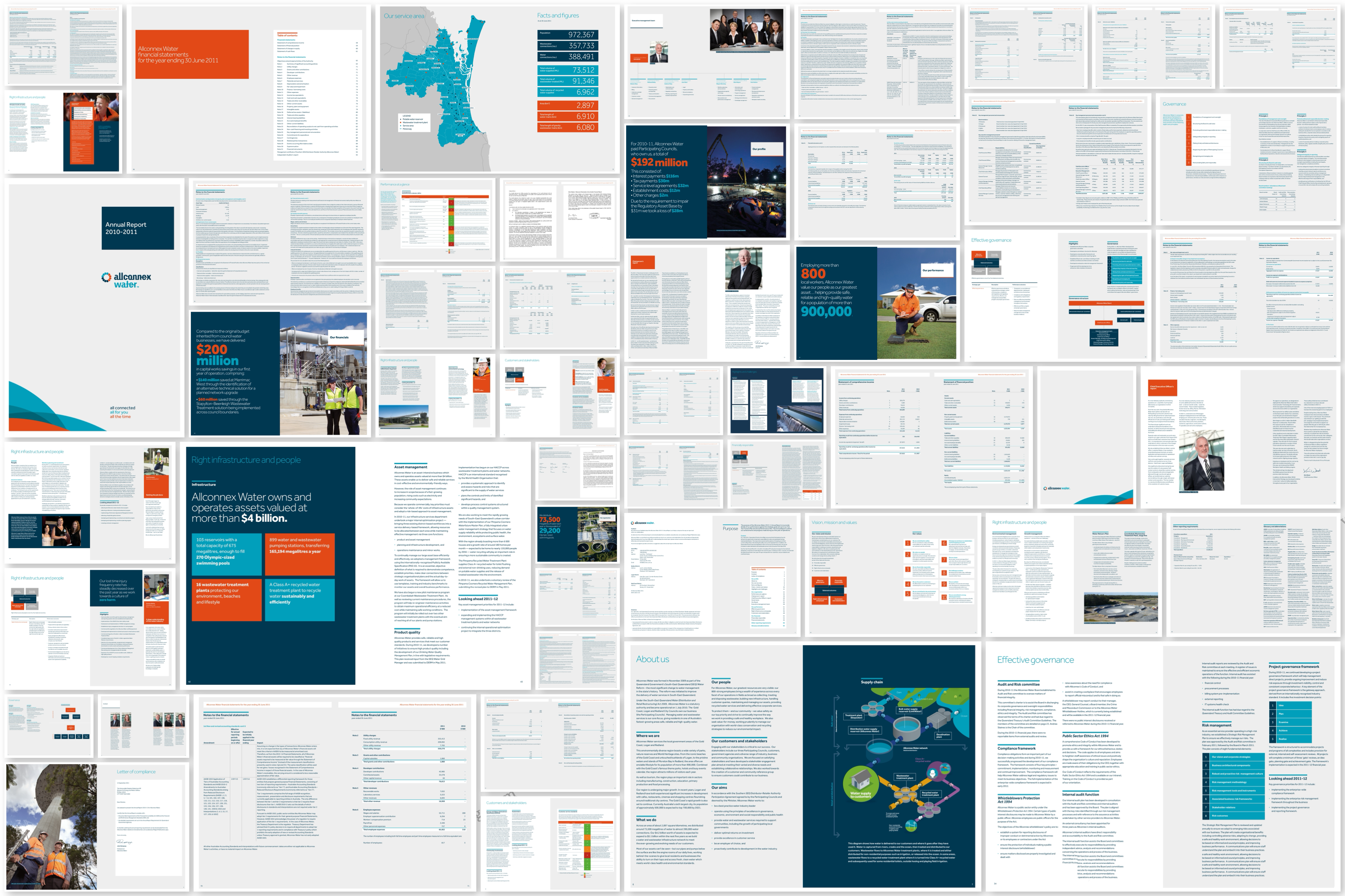
Corporate stationery, uniforms, publications, environmental messaging, and facility branding were brought under a single visual system. I developed comprehensive brand guidelines and trained Allconnex communications staff to apply standards independently, reducing dependency on external design resource for routine materials.
Public-sector design is about trust. If the identity looks inconsistent, the service feels unreliable.
Stakeholder alignment across three councils
Each council had existing visual preferences and approval chains. I worked directly with communications teams and senior stakeholders to negotiate a single approach, building trust through structured presentations, clear rationale, and phased rollout that demonstrated progress before full commitment.
Accessible by default
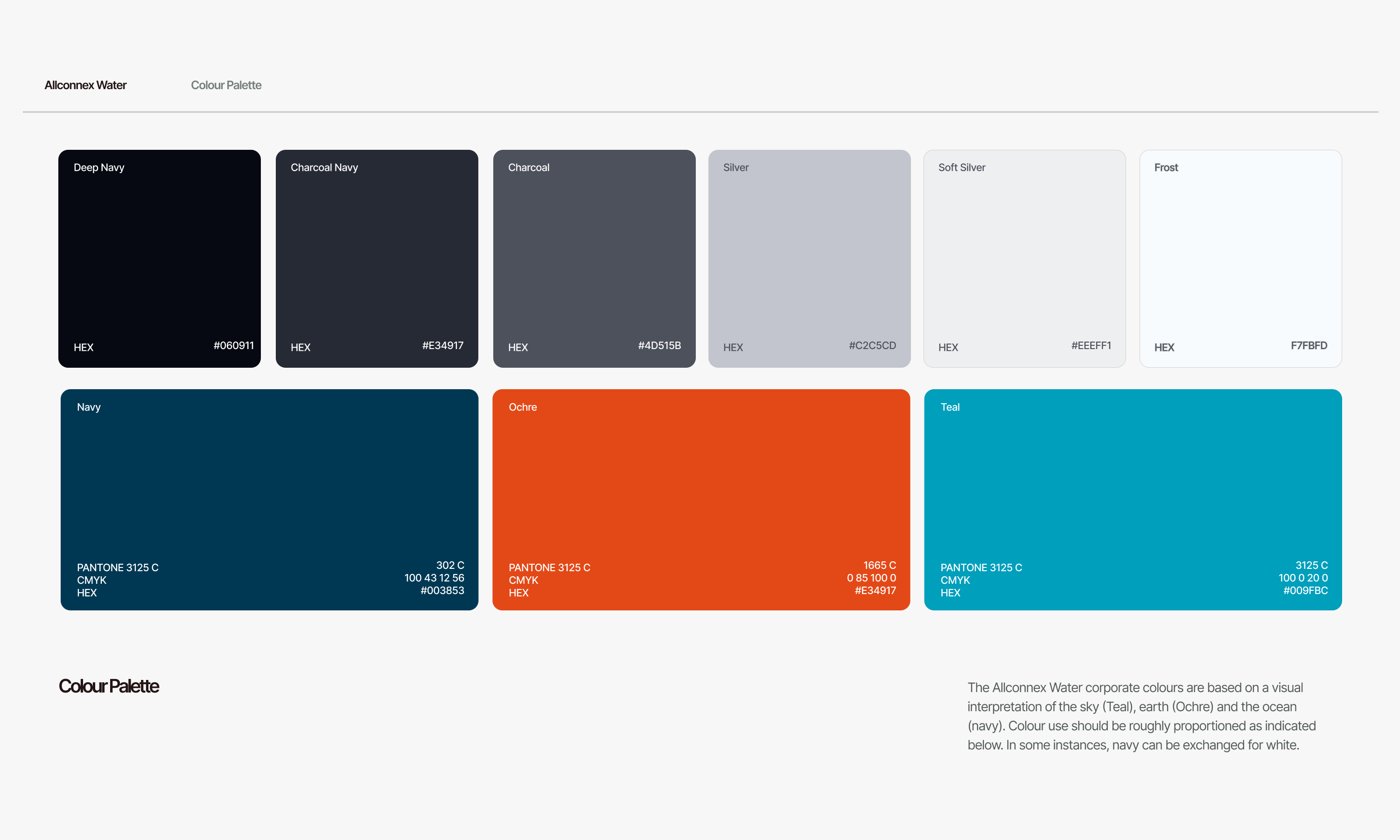
All public-facing materials were designed to meet Queensland Government accessibility standards — clear typography hierarchy, high-contrast colour applications, and plain-language messaging. Inclusive design was treated as a core requirement, not a compliance afterthought.
All Projects